SaaS website
Kodex
A landing page that shows teams how much time they save by sharing what they know.
- Product
- Kodex
- Category
- Knowledge sharing for teams
- Deliverables
- Landing page, mobile, components
- Iterations
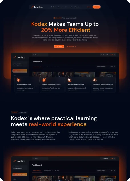
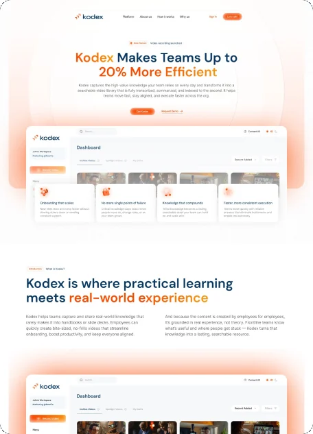
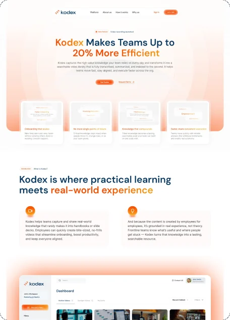
- Dark, light, V2, final V3
Overview
Turning team know-how into a page that gives time back.
Kodex turns what a team knows into a searchable video library, transcribed and indexed to the second.
I designed the landing page in dark and light, refined it, and delivered a third version for desktop and mobile. The file also has a logo and brand kit page and a components page.
The challenge
An abstract product with a lot to promise.
- 01A knowledge library is hard to picture before use.
- 02The page had to explain what Kodex is, how it works, why it matters and how it stays safe.
- 03Visitors needed one next step: Get Kodex or Request Demo.
The approach
Warm orange light, real UI, a short story.
- 01An orange glow and navy and orange headlines add warmth.
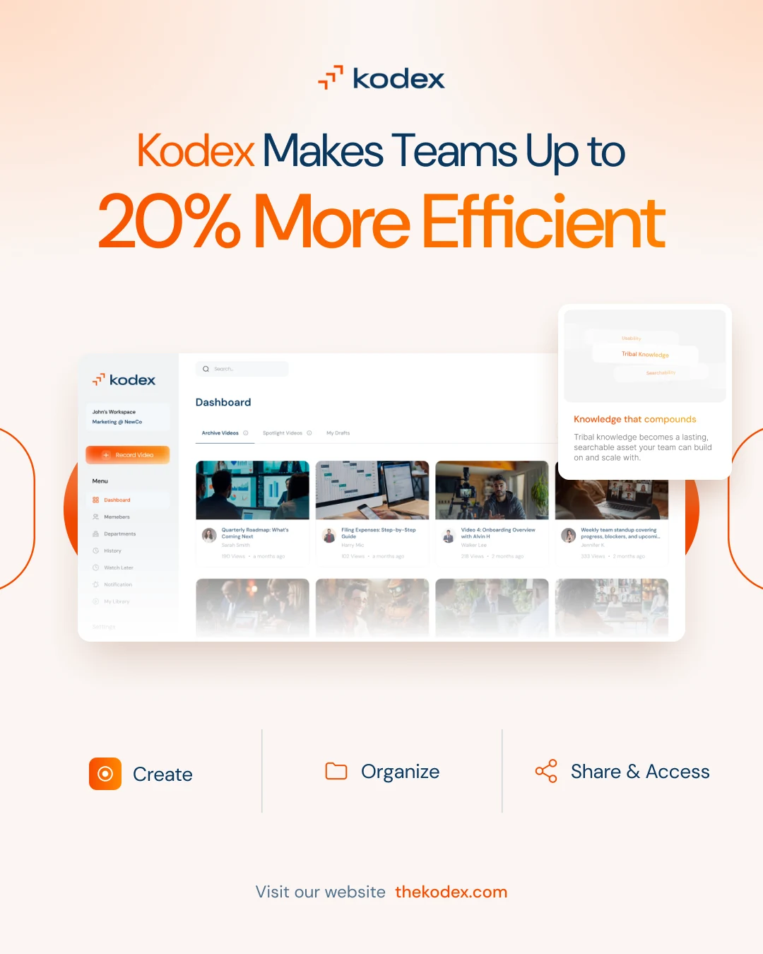
- 02A dashboard mockup with a workspace and video cards shows the product early.
- 03Small pill labels open each section, so the page reads as steps.
Structure
One page, seven chapters.
Structure from the section names of the final landing page.
Landing page
- HeaderNavigationHeroBenefit cards
- IntroductionWhat is Kodex?Dashboard preview
- How it worksCreateOrganizeShare & Access
- Why Kodex?Knowledge hubEmployee-driven learningDisrupting training
- SecurityKeeping your content safe
- User storiesTestimonials
- ContactCall to actionFooter
Key screen
The hero, explained.
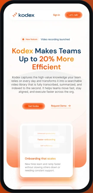
A two-tone promise, two actions and four benefit cards on a warm orange stage.
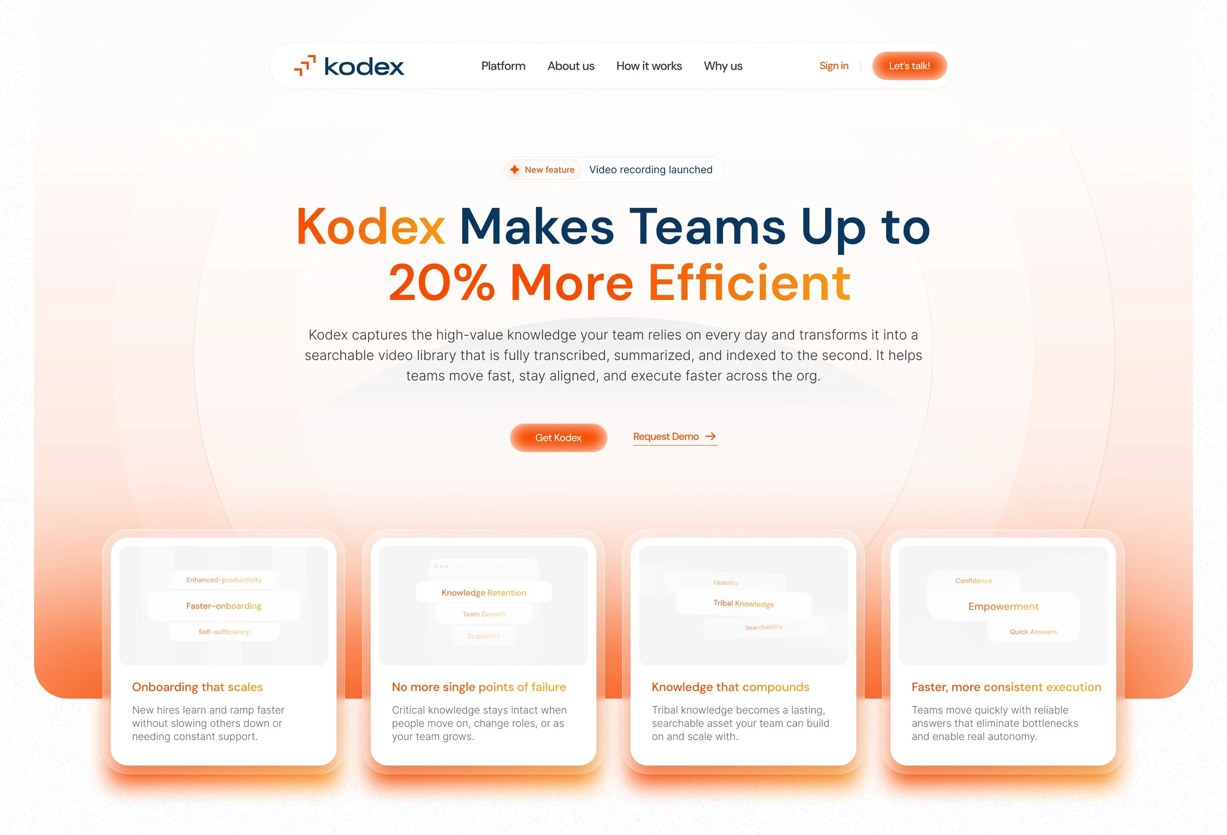
- 1Floating navigation
Platform, About us, How it works, Why us, Sign in and Let's talk!
- 2News badge
New feature: Video recording launched, above the headline.
- 3Two-tone headline
Kodex Makes Teams Up to 20% More Efficient, in navy and orange.
- 4Two actions
Get Kodex is the button. Request Demo is a link.
- 5Benefit cards
Onboarding, single points of failure, compounding knowledge, faster execution.
- 6A warm stage
A soft orange gradient frames the first screen.
Page flow
From promise to proof.
The page explains the product, shows it working, then answers: why, and is it safe?
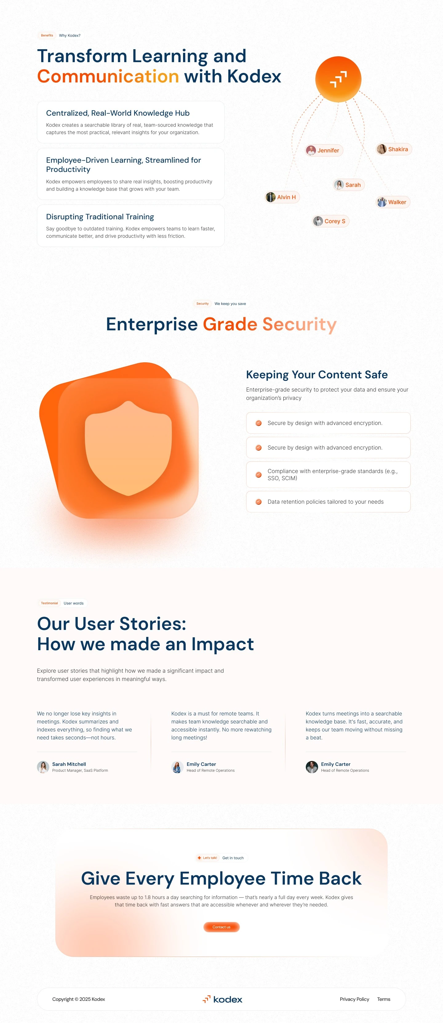
- 1Hero
The promise, two actions and four benefit cards.
- 2Introduction
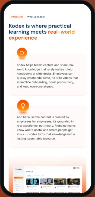
Where practical learning meets real-world experience, with a dashboard preview.
- 3How it works
Create, Organize and Share & Access, each with a UI card.
- 4Why Kodex?
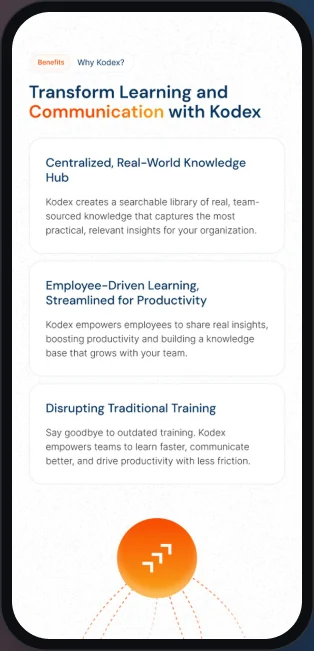
Three benefits around a network of team members.
- 5Security
Enterprise Grade Security, with a shield and a checklist.
- 6User stories
How we made an Impact, in three short quotes.
- 7Call to action
Give Every Employee Time Back, then the footer.
How it works
Three steps, three small interfaces.
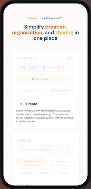
Each step shows a piece of the real product, not an icon.
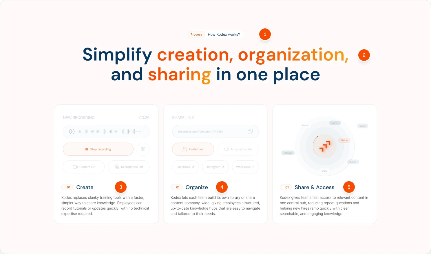
- 1Section label
Process: How Kodex works? in a small pill.
- 2Highlighted verbs
Creation, organization and sharing in orange, in a navy headline.
- 3Create
A recording card with waveform, timer and Stop recording button.
- 4Organize
Share link, invite and channel options for each library.
- 5Share & Access
Team members circle the Kodex mark in one hub.
Directions
Dark, light, then refined.
The file keeps a dark version, a light version and a second version before the final.
Mobile
The same story at 430 px.
I laid out the final version again for mobile, with stacked cards.
Visual language
Orange light on navy and cream.
Orange is for actions, navy for headlines. Cream and night set the two directions.
- Orange
#F74B02 - Amber
#FF8900 - Navy
#0A375F - Night
#020818 - Graphite
#13151B - Grey
#8E959F - Cream
#FDFAF9
Typography
Headlines and body
Aa
DM Sans
Headlines, section labels and body copy across the page.
- Regular
- Medium
- SemiBold
Product ui
Dashboard
Inter
Used inside the product mockups and small interface details.
- Light
- Regular
- Medium
Deliverables
What I delivered.
- Landing page, dark
- Landing page, light
- Landing page V2
- Final landing page V3
- Mobile layout, 430
- Header variant
- Components
Want this kind of clarity for your SaaS website?
Book a free 30 minute call. You leave with 3 written fixes, even if we don’t work together.
 Nafees ZulfiqarUsually replies within an hour
5.0 from 33 Upwork reviewsTop Rated