Website
Massicotte
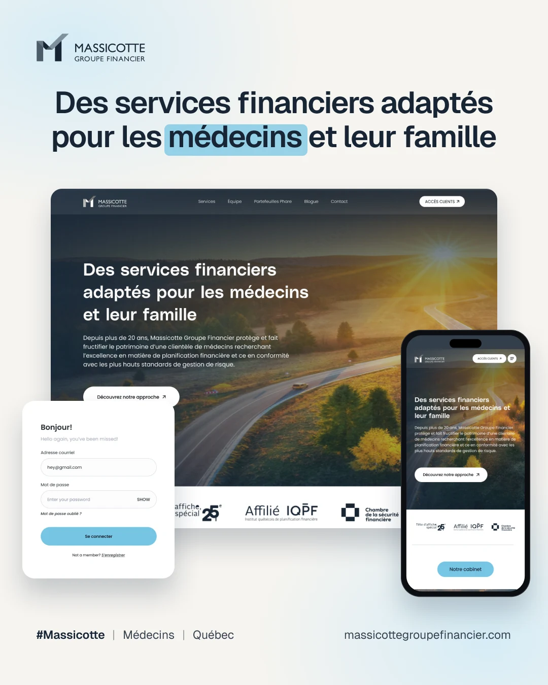
A money planning website made for doctors and their families.
- Industry
- Wealth management
- Audience
- Physicians and their families
- Deliverables
- Website UI, client area, responsive layouts
- Pages
- Home, Services, Team, Portfolios, Blog, Contact
Overview
One audience, spoken to directly: physicians and their families.
Massicotte Groupe Financier offers financial planning, insurance and investments for physicians, with a secure client area.
I designed every page for desktop, tablet and mobile, plus client login, registration and password recovery.
The challenge
A complex offer, a busy audience, three screens.
- 01Planning, insurance and investments had to be clear to busy people.
- 02Every page needed desktop, tablet and mobile layouts.
- 03Clients needed a secure area with login, registration and password recovery.
The approach
Calm images, short sections, a clear client path.
- 01Golden-hour landscape photos and deep navy set a calm tone.
- 02Sky blue pill labels (Notre cabinet, Nos services, Notre démarche) make pages easy to scan.
- 03A permanent Accès clients button leads to the client area from any page.
Structure
Six sections and a client area.
Structure from the main navigation and page designs.
Accueil
- ServicesPlanification financièreAssurancesPlacements
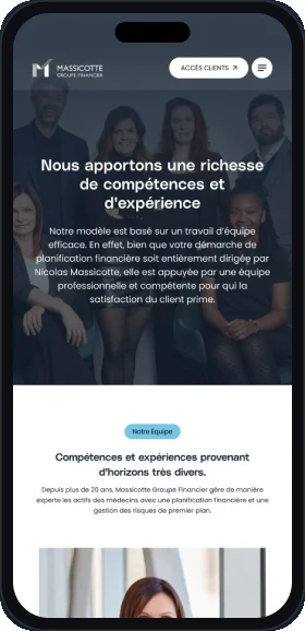
- ÉquipeTeam profiles
- Portefeuilles PharePortfolio page
- BlogueArticlesArticle detail
- Contact
- Accès clientsConnexionInscriptionMot de passe oublié
Key screen
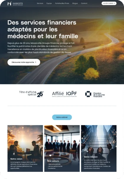
The home page hero.
The first screen names the audience, gives one next step and shows credentials.
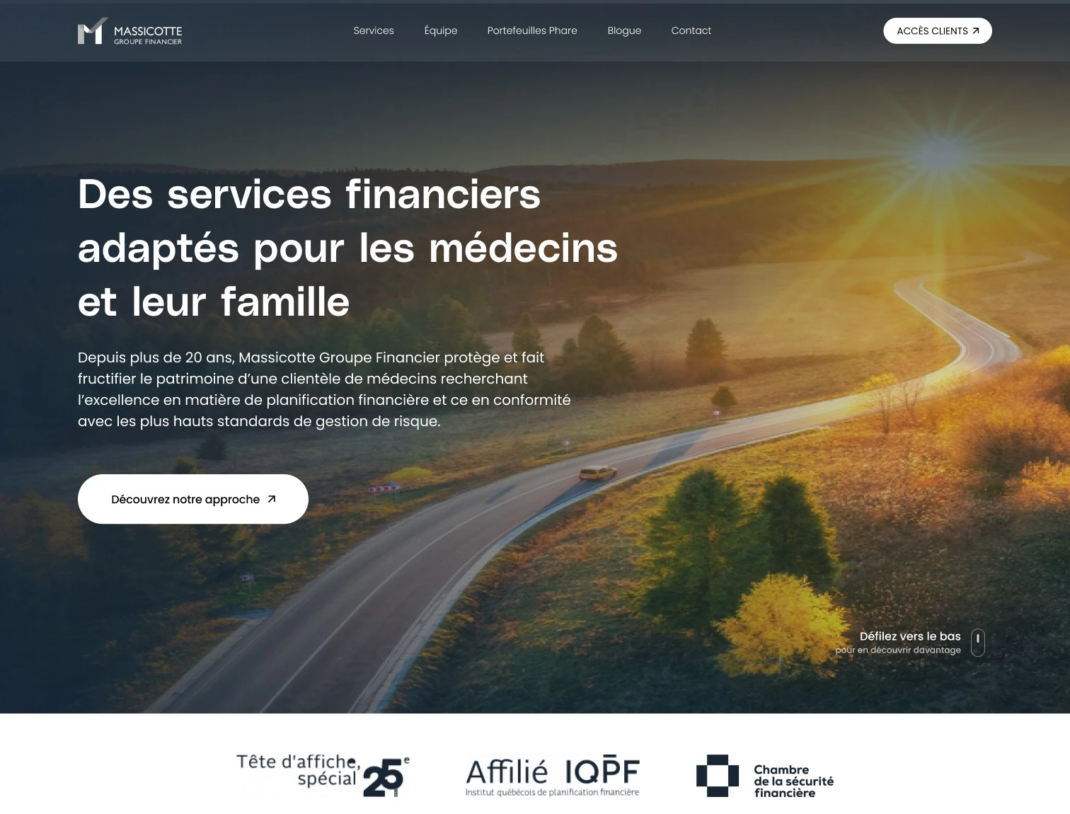
- 1Client access, always visible
Accès clients is a white pill in the navigation.
- 2Audience in the headline
The first line names physicians and their families.
- 3One clear next step
Découvrez notre approche leads to the method section.
- 4Scroll cue
A small prompt invites visitors to keep reading.
- 5Credentials up front
Affiliations sit under the hero to build trust.
Page flow
A home page that answers, in order.
Sky blue pill labels turn a long page into a short list of answers.
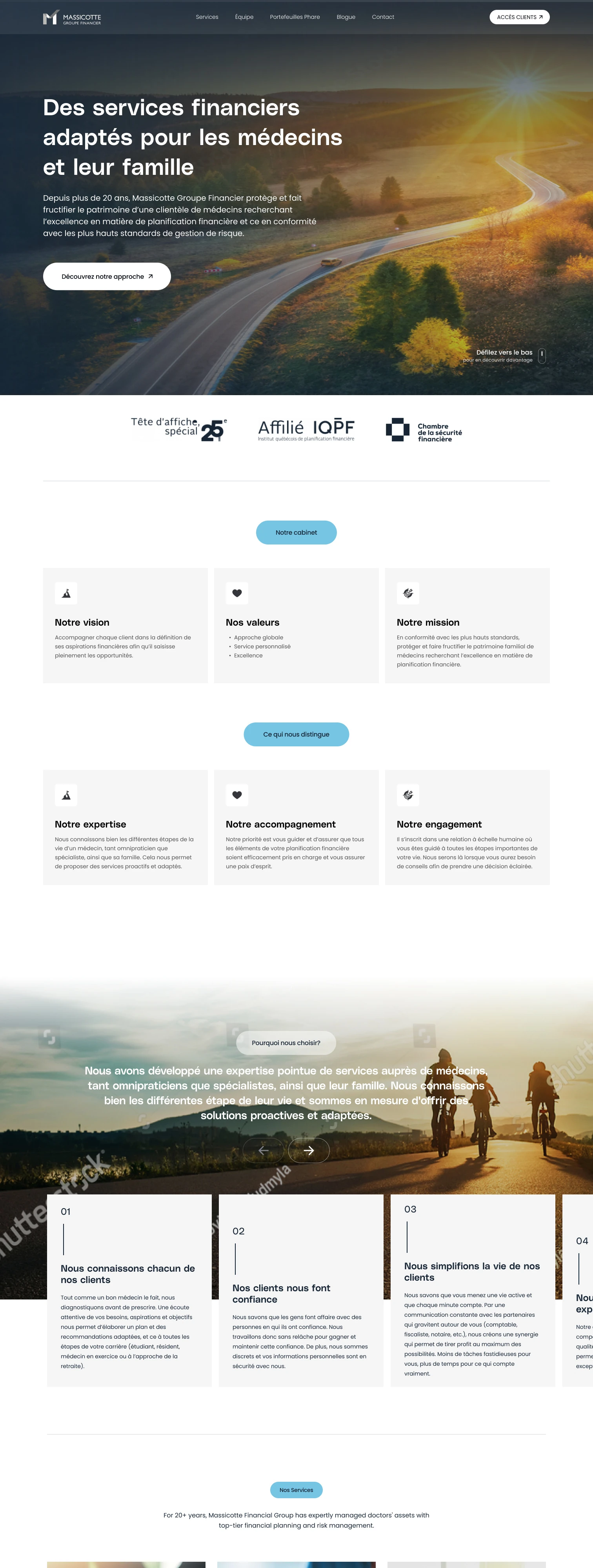
- 1Hero
The promise to physicians and families, with one call to action.
- 2Affiliations
Tête d'affiche, IQPF and the Chambre de la sécurité financière.
- 3Notre cabinet
Vision, values and mission in three cards.
- 4Ce qui nous distingue
Expertise, accompaniment and commitment, as three points.
- 5Pourquoi nous choisir?
A numbered slider of reasons over a wide photo.
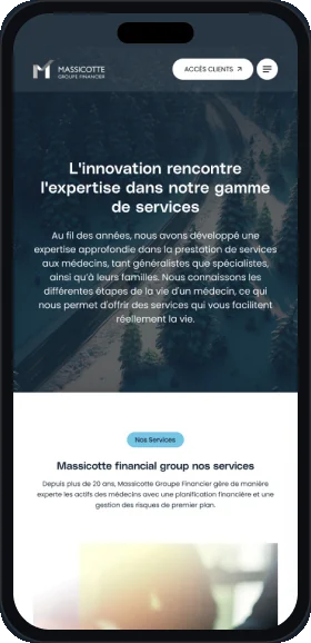
- 6Nos services
Planning, insurance and investments as photo cards.
- 7Notre démarche
The planning method and the seven areas set by the IQPF.
Client area
Signing in.
The client area opens as a card over the blurred home page.
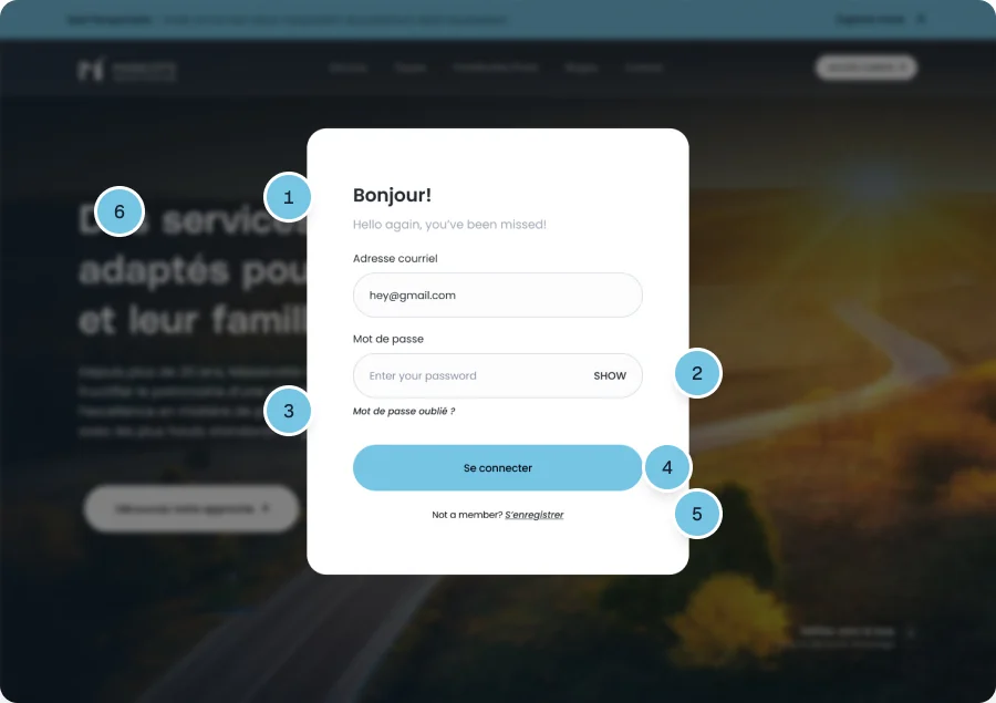
- 1Warm welcome
Bonjour! and a short line greet returning clients.
- 2Show password
A toggle shows the password before signing in.
- 3Recovery one tap away
Mot de passe oublié links straight to recovery.
- 4One primary action
Se connecter is a full width sky blue button.
- 5Registration path
New clients can register from the same card.
- 6Context kept
The blurred home page behind keeps the site in view.
Responsive
Three breakpoints, every page.
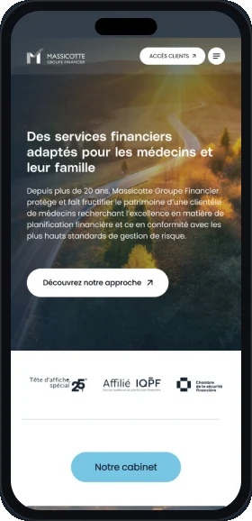
Each page is designed at 1512, 744 and 430 px, not just scaled.
Desktop
1512 px
Tablet
744 px
Mobile
430 px
Visual language
Navy, sky and golden light.
Navy is for text and panels. Sky blue marks labels and actions.
- Navy
#172534 - Sky
#76C5E4 - Ink
#03070F - Charcoal
#242A31 - Grey
#707070 - Mist
#F5F5F5 - White
#FFFFFF
Typography
Heading typeface

PolySans
Headlines and card titles, from the hero line to the service cards. Median and Neutral weights.
- Neutral
- Median
Body typeface
Aa
Poppins
Body copy, buttons, navigation and labels across the site.
- Light
- Regular
- Medium
- SemiBold
Deliverables
What I delivered.
- Desktop pages, 1512
- Tablet layouts, 744
- Mobile layouts, 430
- Client login
- Registration
- Password recovery
- Blog and article pages
Want this kind of clarity for your website?
Book a free 30 minute call. You leave with 3 written fixes, even if we don’t work together.
 Nafees ZulfiqarUsually replies within an hour
5.0 from 33 Upwork reviewsTop Rated