Brand identity
Saivox
A logo, colours and brand rules for a growing tech company.
- Industry
- Crypto trading, B2B and B2C
- Deliverables
- Logo, brand guidelines, app icons, applications
- Guidelines
- 36 pages, Version 1.0
- Typeface
- Proxima Nova
Overview
A sharp brand that leans forward.
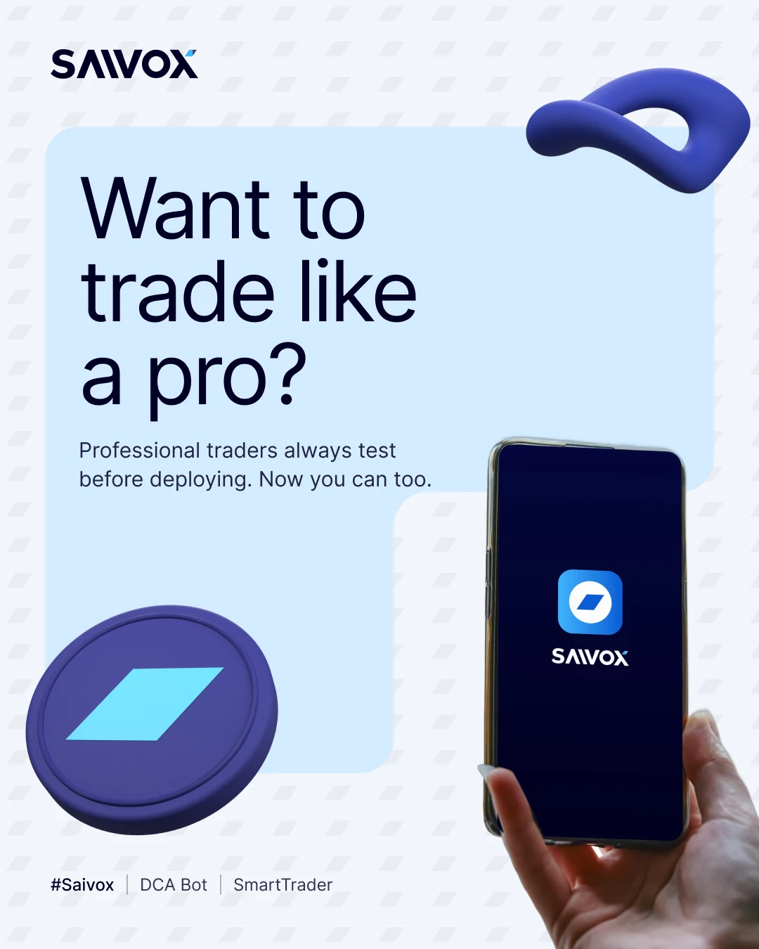
Saivox is a platform for virtual asset trading. It offers automated trading for retail users and businesses, with DCA and grid trading bots.
I designed the logo and a 36 page brand book, from the mark to app icons.
The challenge
One brand for traders and businesses.
- 01It had to speak to retail traders and businesses at once.
- 02The mark had to work from browser icon to building sign.
- 03Crypto is crowded, so it needed one clear shape.
The approach
A diamond in a circle, leaning forward.
- 01An angled diamond inside a perfect circle, on a grid.
- 02A custom wordmark with a stylized A and a leaning X with a gradient blue slice.
- 03A blue palette with four bright accents, set in Proxima Nova.
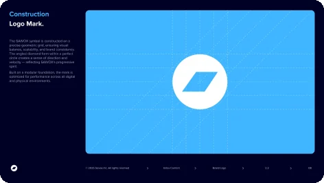
The mark
A diamond inside a circle.
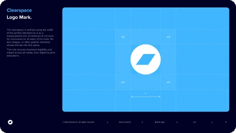
A precise grid keeps it balanced at every size.

- 1A perfect circle
White on blue or blue on white.
- 2Angled diamond
It leans forward to show direction and speed.
- 3Geometric grid
Dashed guides set the size and place of each part.
- 4Diagonal guides
Angled lines set the slant of the diamond.
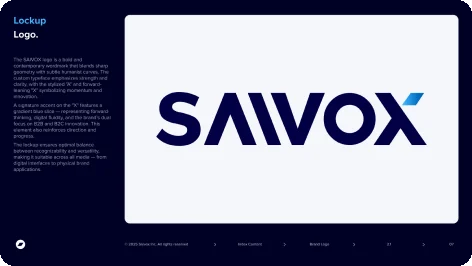
The wordmark
Sharp shapes, one blue slice.
Bold enough for signs, clear enough for a nav bar.
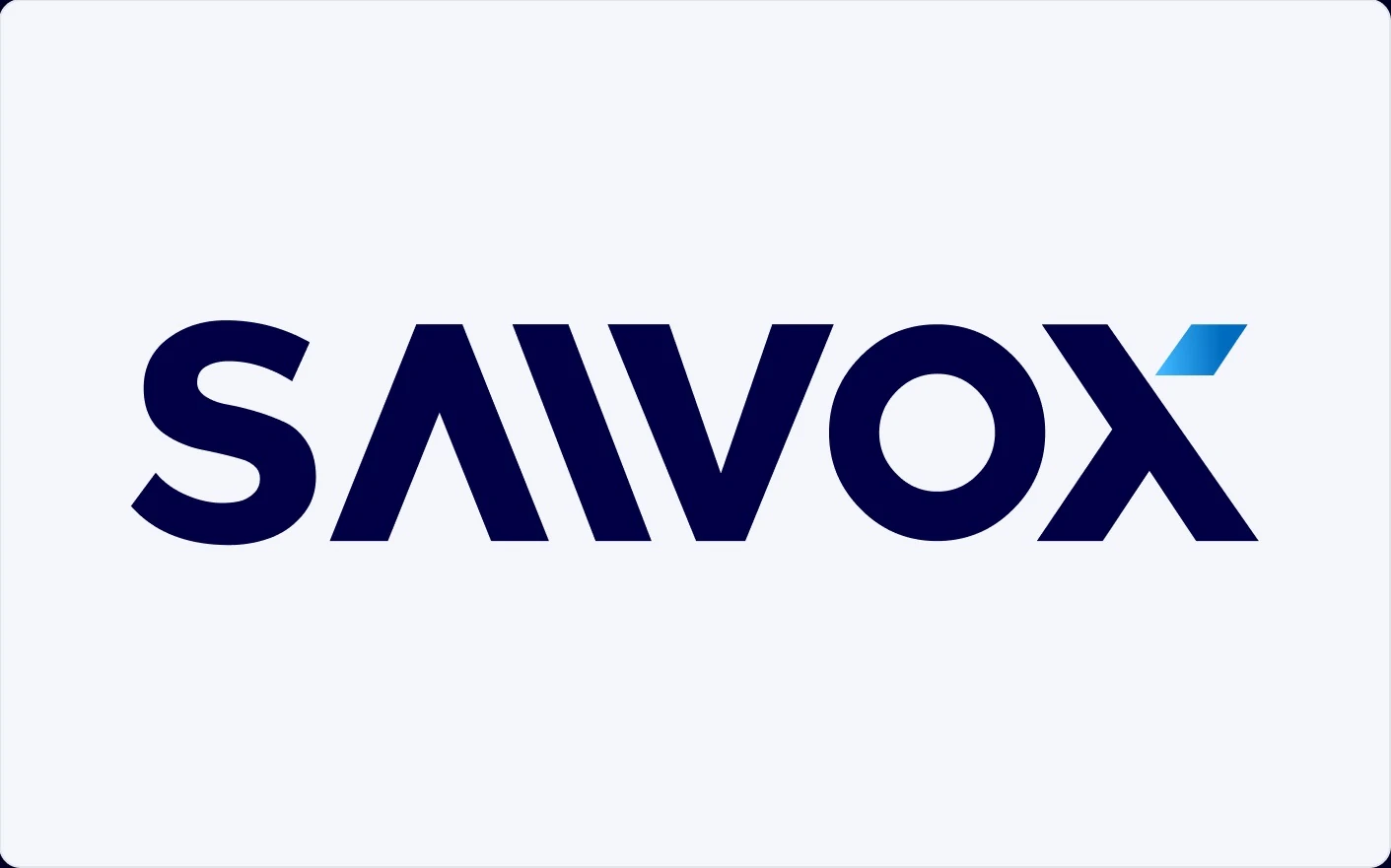
- 1Humanist S
Soft curves ease the sharp letters.
- 2Stylized A
No crossbar, so it looks like an upward chevron.
- 3Round O
A clean circle that echoes the mark.
- 4Forward leaning X
It leans ahead to show momentum.
- 5Gradient slice
A blue gradient accent, the wordmark's signature.
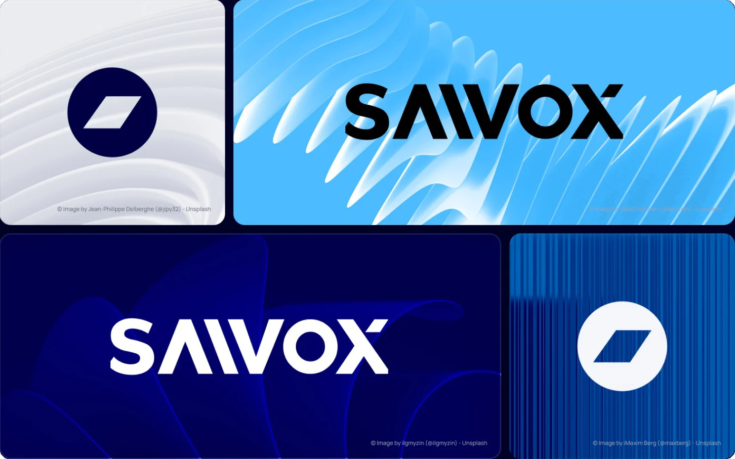
Logo on backgrounds
White on blue, navy on light.
Always one solid colour, over blue gradients and brand images.
Visual language
Blue first, with bright accents.
Three blues and a soft white lead. Bright accents add energy.
- Sky Blue
#3FB6FF - Azure Blue
#006CBF - Deep Navy
#010044 - White
#F5F6FC - Cyan
#2ED0FF - Yellow
#F3CE3A - Red
#E92E4A
Typography
Primary typeface
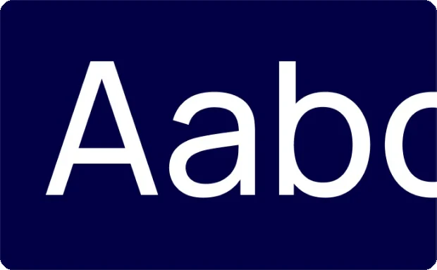
Proxima Nova
Designed by Mark Simonson. Used for headlines, body copy and the guidelines themselves.
Weights
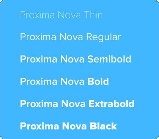
Thin to Black
Six weights from the guidelines, from Thin for large display to Black for impact.
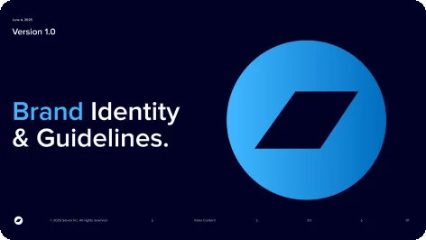
The guidelines
A 36 page brand book.
Every rule has its own page.


Applications
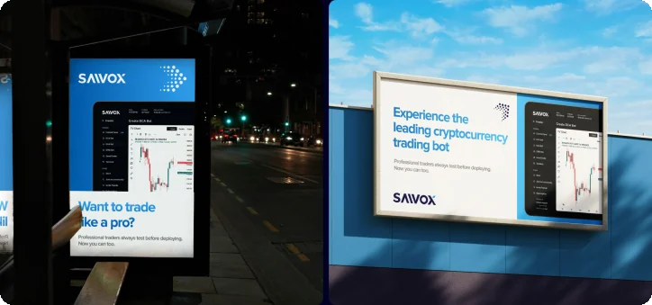
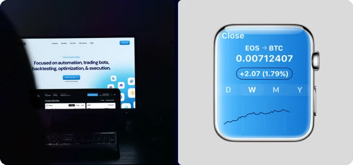
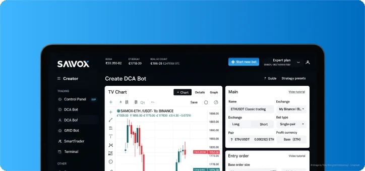
From the street to the home screen.
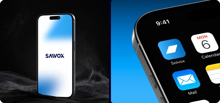
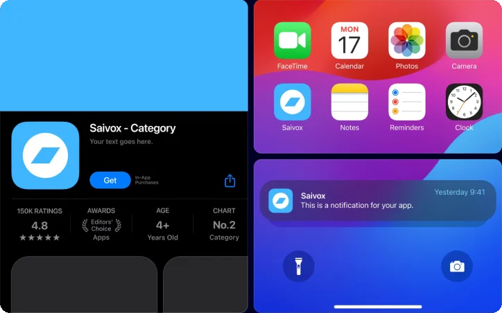
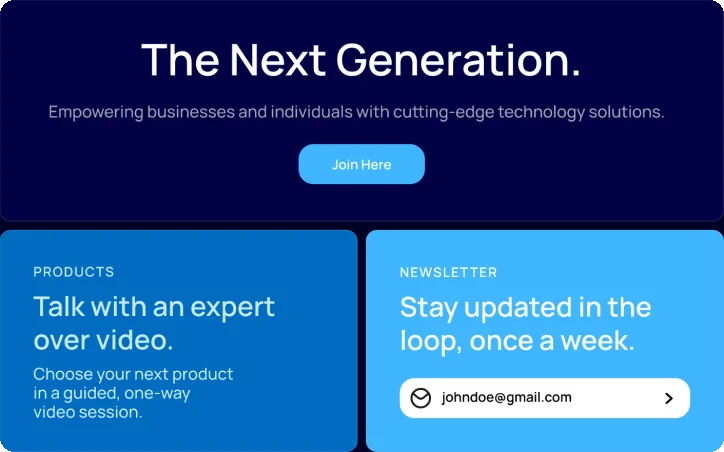
Billboards, a bus shelter, devices and app icons share one mark.
Deliverables
What I delivered.
- Logo mark
- Wordmark and lockups
- Construction and clearspace
- Colour palette
- Typography
- App and social icons
- Brand guidelines
- Brand applications
Want this kind of clarity for your brand identity?
Book a free 30 minute call. You leave with 3 written fixes, even if we don’t work together.
 Nafees ZulfiqarUsually replies within an hour
5.0 from 33 Upwork reviewsTop Rated